Scotts Project Trust
Rebrand and bring light to a great cause in the modern environment
Branding
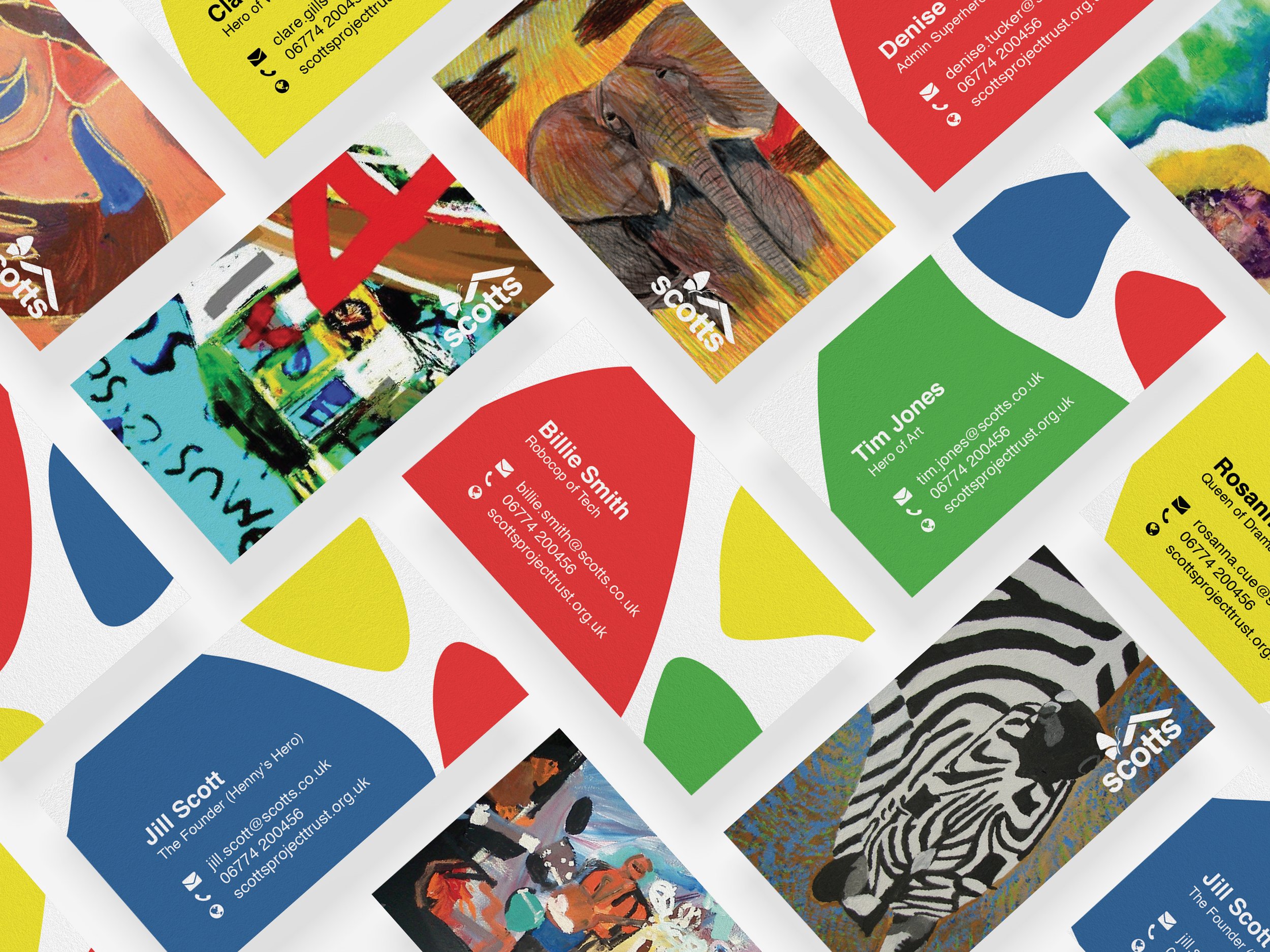
Scotts Project Trust is a community centre to help people with special needs develop everyday skills, tucked away in the quiet ends of Kent. The modernised identity system brings a fun, loving and supporting feel to people with learning difficulties. It’s based around the history of Scotts and why they set the community up. The two t’s connect to signify people coming together and also forms an H in great homage to the founders daughter.

Growth and transformation of the brand and individuals with special needs
The ideology of the vibrant butterfly is to show growth, development and freedom which signifies the ethos of the charity. The pattern of the butterflies wing is evident through out applications.
Are you a charity and need some design support? Enquire today!
Are you a charity and need some design support? Enquire today!