
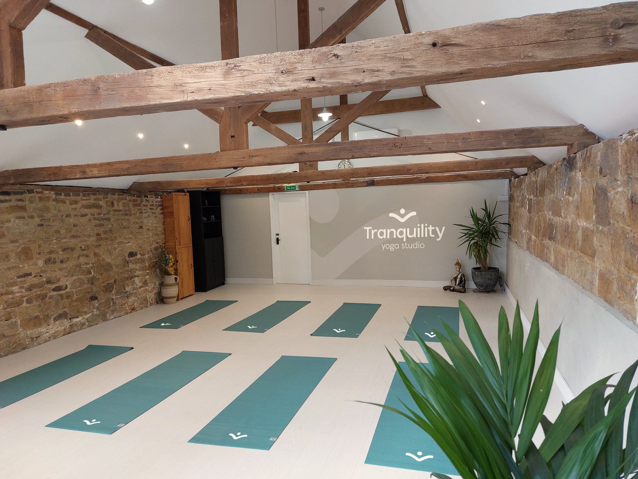
Tranquility yoga
A carefully crafted space for those who love yoga, in the heart of the Ashdown Forest
Branding | Website design
Tranquility wanted to create a unique space for people to perform and teach yoga in a location that escapes the city. They wanted an identity that strayed from the cliche iconography used within the yoga industry.
The branding journey took inspiration of the surrounding area using familiar shapes to signify freedom and nurture to craft a new symbol for the yoga community.


Crafting a symbol of freedom and tranquility
We built a brand of trust, freedom and flexibility, a symbol of its own to reflect the studios ambitions and vibes.
The brand journey explored the lotus flower from an aerial view that then progressed, after much experimenting, into other imagery of yoga to reveal the final icon of a person with open arms, that signifies freedom and also reveals a silhouette of a flying bird which brings a sense of freedom and tranquility. The symbol for Tranquility is instantly recognisable across many applications that we explored and as the brand grows it can represent the brand as itself.

The wings of a bird

The open arms


